Thursday, 28 April 2011
My Evaluation
After making our films we made evaluations to explain the process we went through to create the final piece.
My Film
Here is my final film piece.
IMPORTANT NOTICE: Sometimes the video appears slightly out of the white area of the blog post and the buttons freeze temporarily, it should move itself within a few minutes and play as normal.
My Poster

This is my final film poster. I took 4 seperate photos and arranged them together using the fireworks software. I took a photo of the sky and altered the brightness levels to make the colours stand out more, to make it have a bolder appearance. I did the same with the picture of the grass along the bottom. I didn't simply use the grass from the photos of the gril because I wanted it to look almost artificial and surreal. I darkened the colour and cut it out. With the picture of the girl, I lightened the picture to make her look exposed with high key lighting and then smudged her around the edges to make her look almost ghostly, which is significant to my film. The "PIG" letters' colours were not altered at all, instead I changed the lighting in the room to get the desired effect. I cut out each letter individually so that I could move each letter seperately as I did not want them to sit in a straight line. I created the certificate rating on fireworks making a simple red circle with "15" written in it. I put my tag line in the appropriate place so that it was symmetrical. I then tried to recreate a similar font to other film posters for the bottom text which states the director etc. I wanted a simple font for the "Starring..." part as there are a lot of colours on the poster and I didn't want it to look overdone. I chose a simple white for the colour so not to distract from the main subject.
Tuesday, 26 April 2011
Photos for my review
For my review I decided to use a different picture of the subject so that it could look like a portfolio picture belonging to the actor. This is why I have her smiling, but I have used the sky from the poster so that it links it to my film. I made her face brighter using the Fireworks software and smudged her face a little to make it look as though she is blending into the background, I also wanted to make it look softer.


The final product


The final product
My pictures for my poster
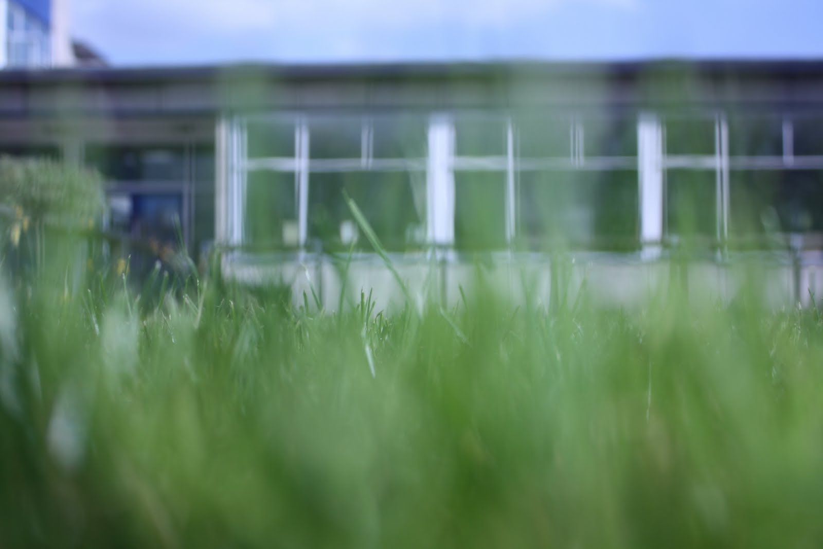
When composing my poster, the sky was the part I most experimented with to get right. I took many photos from all different angles with different clouds and the sun being in a different place. I took photos of my subject closer up and then further away so that when I put it with the background of the sky, I could decide which would look best. I also took photos of the grass, some of them were closer up than others to try and get the best shot that I could cut out to go over the top of the subject so that it looks like she is laying in the grass. I didn't use the grass from the original picture of the subject as I wanted it to look artificial, it was also so that I could manipulate them separately. I took photos of the same newspaper cuttings of the letter "PIG" as I wanted there to be a continual flow throughout my pieces and as these appear very frequently and are a prominent item in my film.


Thursday, 7 April 2011
Film Review

You can click to enlarge, but if you still cannot read it this is the script
Another exquisite release in Emily Clark’s short film collection.
The cleverly named “PIG” leaves the audience guessing from beginning
to end. Sadam Yousef and Oliver Buckner give the performances of
their careers to date in their passionate, heartfelt acting styles.
A remarkable story of love, betrayal and corruption.
The opening scene sets the tone of a crime drama well
in the way we know Detective Logan (Yousef) is not supposed to be
involved in the case. We truely believe his love, anguish and grieving
for his late wife in the way he interrogates Scott Turner (Buckner).
Moments later we are transported back in time to the scenes of the
murder in sudden flash back form. Isabella Logan’s (Egan), dramatic
attempt at escape can seem a little false and forced at times, but
takes nothing away from the tone of the piece. “I want to play a game”
says Logan, a classic postmodern twist from an already classic film
saga “Saw”. The two films combined would make that of a masterpiece,
something to be considered perhaps. The two locations are perfectly
selected, that of a desolate waste land, where no one could possibly
be found, flourished in colour with high key lighting, exposing every
action of the desperate victim, to a claustrophobic interrogation
room, lacking in colour, personality and life.
Logan’s cornering of Turner is admirably clever scripting, leaving Turner
with no answers as it would seem that his fate has already been
sealed. Everything about this film, from the composition to the use of
props has been perfectly thought out and strung together with transitions
that would make any film maker proud. A particular triumph has got
to be the transitions made into photographic evidence style shots,
with the magazine cut out words. It includes every aspect of a police
experience, it even makes the audience feel guilty to an extent.
Lighting plays a key role in this piece, every shot of Logan has incorporated
Rembrandt style side lighting, which makes us feel his emotion, his
dark side that wishes to ensue punishment on the one responsible for
the death of his wife. The subtle sense of guilt both characters exhume
helps to confuse the audience in a way that keeps them on their
toes throughout and subconsciously makes us suspect everyone
playing a role in this case.
The story leaves its audience gripped from beginning to end. We
want to believe that our suspect Scott Turner is guilty in the way
the past and present is brought together to make it seem as though
he is imagining it. Only at the grizzly end do we learn the full power
of the truth. It will leave anyone in wonderment yet suspicion
of what those who are meant to protect us are truly capable of, and
can they really get away with it?
VERDICT
An inspiring piece that invites others to use similar techniques. Congratulations are in
order, and, of course, we must never forget appearances can be deceptive.
Tuesday, 29 March 2011
My Review
To make my review look realistic I used Fireworks to create my own version of the Film4 website, everything on it has been made by myself, here is some evidence.


I made coloured rectangles and then found the font that best matched the font used on the Film4 website. I then had to layer them into the correct order, for example, sending the rectangles to the back and having the text over the top. I wanted it to look at similar as possible so that it looked like a real review.


I made coloured rectangles and then found the font that best matched the font used on the Film4 website. I then had to layer them into the correct order, for example, sending the rectangles to the back and having the text over the top. I wanted it to look at similar as possible so that it looked like a real review.
Sunday, 27 March 2011
Audience Feedback
I posted my film on popular social networking sites, Facebook, Twitter and Youtube.
The only feedback I got was on Facebook.


The "likes" I can only assume is positive feedback, as well as the "likes" on other people's comments.
I particularly liked "Emily Jayne Lister's" comment as she picked up on the technical aspects I had used rather than just making basic comments that she liked it. I was pleased that she had appreciated what I had worked so hard to achieve.
Sunday, 30 January 2011
Screen Shots

This picture demonstrates Rembrandt style side lighting. I have put it onto the suspect to show that he could maybe be responsible for the murder, even though throughout interrogation he has no side lighting to hint to the audience that he is innocent.

All of the scenes with the victim in it have high key lighting. I wanted it to be very bright so that she looked even more vulnerable and to show that there was no where for her to hide, he death was inevitable.

This shot uses very severe Rembrandt style side lighting to allude to the detective's evil side that killed his wife. I wanted him to look very sincere so that the audience could either think it was because he is upset or because he is guilty. The contrast in the strong light to the very shadowed background shows that he is in the shadows, as the shits with the suspect are much brighter to show his innocence.

This shot has a high contrast in light. It shows his face to be very exposed but his body shadowed. This was also to demonstrate his dark side. The camera angle was made to make him seem of higher status and power, to show that he is able to get away with the crime he has commited.

The severe lack of shadowing on his face here shows his innocence, and the shadow behind him to show that he had a bad past, his drugs past, but that he did not commit this crime. The background is significantly lighter to show that he is the innocent one.

This shot is at the beginning of the film, with not much shadowing on his face. It then progresses to the end of the film with the shot below with spreading darkness across his face to show his dark side getting worse and his evil side growing.

Monday, 24 January 2011
Filming
My second attempt at filming took place on Friday 21st January. I temporarily re-wallpapered my lounge with lining paper so that the walls were white and set up my table and chairs there. Not only was the location more convenient as it was closer to home but as the room was smaller, the sound and lighting was a lot easier to control. I felt that in my second attempt I have learnt a lot from the first. The lighting is so much better as it really depicts the characters' personalities well which my first attempt did not capture. I also changed the location of the chase scene as previously it was too dark.
Tuesday, 18 January 2011
Filming and Location
I filmed the interrogation scene in my film on Monday 10th January. My locations are set in two different places, and I aim to film the next part on Friday 21st January. My first location that was used last night is a garage unit at Stansted. Although quite far away, the room was perfect for what I wanted. Within the unit there is a car spraying room, a plain white walled room with very heavy lighting, so not to cast any shadows when spraying the cars. This was perfect for my film, as it was so bright, which was what I wanted for parts of it, I thought it was easier to control the lighting.
Here are some pictures of my location at Stansted:


Here are some pictures of my location at Stansted:


Problems I encountered
The morning of filming, one of my characters cancelled on the evening's plans, so I had to substitute them very quickly, somebody who could come to Stansted with me for the whole evening, luckily someone was available. Other problems were that I did actually try to film the outside scenes, but due to the time of year, it soon got very dark, meaning that the shots were barely visible, they will have to be redone on the later date stated above. In the unit, moving the camera around became difficult due to the tight spacing in the room. Alongside this, I had to light my suspect's face without casting light on the detective's face, although after a while of moving the halogen lamps, I eventually got the lighting I required.
The morning of filming, one of my characters cancelled on the evening's plans, so I had to substitute them very quickly, somebody who could come to Stansted with me for the whole evening, luckily someone was available. Other problems were that I did actually try to film the outside scenes, but due to the time of year, it soon got very dark, meaning that the shots were barely visible, they will have to be redone on the later date stated above. In the unit, moving the camera around became difficult due to the tight spacing in the room. Alongside this, I had to light my suspect's face without casting light on the detective's face, although after a while of moving the halogen lamps, I eventually got the lighting I required.
When filming, I decided to add a few extra shots. I decided that it would be strange for the victim's husband to be interviewing the suspect, as this would not be allowed in real life. So I added a scene where the policeman and the detective have a discussion about why he shouldn't be there. I added a scene where they are both smoking, because I felt that this helped to build up some tension between the characters, in the way that a cigarette is offered to the suspect and how it is received. I have also altered my opening credits. I have made it so we get views of all the characters' face from both sides and forward with them holding their hands up as if to be holding something, in the editing process, their names will appear between their hands.
When watching the shots back, none of them real encompassed what I wanted from the lighting aspect of mise-en-scene. As the room was built to cast no shadows it was very hard to control the shadowing on people's faces and in the room where appropriate. For this reason I am going to film the interrogation scene again on Friday 21st January in my house in a room that will be cleared and made to look like an interrogation room. As it is just a normal room, controlling the light will be much easier.
Monday, 17 January 2011
My Animatic
This is my animatic/storyboard that will help me in the filming process. It shows my shots with writing underneath describing what I want in the shots. It shows shot lengths, and ideas for transitions in the editing process.
Tuesday, 11 January 2011
Intended Audience
Short films are not typical Hollywood movies. For this reason, their content is often not conventional and maybe even obscure. For this reason, an audience would not be those who seek out mainstream narratives and plot lines. I would expect them to be slightly better educated as they would not be those who just absorb what the media gives them, having films pushed on to them using web 1.0. My intended audience will be those from 18 upwards, maybe with a cut off of about 40, as this will be the age range my characters could fall in, thus meaning it can be relatable. But also, the plot line is of such a nature that it would appeal to these age ranges.
Characters
This is how I want my male characters to look:


I didn't want their costumes to give anything away about the characters as I wanted the audience to have their own ideas about who they think is guilty, this is why all of their clothes are very plain. The appearance of my female subject is not necessarily important, only that she will be wearing red to connote danger. I wanted all my male subjects to look suspicious in some way through the use of make up.
Props
Here are the props that are to be used the my film:
Car stereo, tape recorder
2 plastic cups
Cigarettes
Table
Chairs
Car
Poster

Car stereo, tape recorder
2 plastic cups
Cigarettes
Table
Chairs
Car
Poster

Magazine cuttings


Subscribe to:
Comments (Atom)